Everfeel was launched as a modern wellbeing brand focused on CBD-based products designed to support balance and everyday quality of life. As a startup entering a competitive and highly sensitive market, the brand required clarity, credibility and a strong emotional positioning from day one.
The objective was not only to create a logo, but to define a complete brand system capable of supporting product packaging, ecommerce and long-term brand growth.
The main challenge was building trust in a category often surrounded by confusion and skepticism. The identity needed to feel clean, calming and scientifically credible without appearing clinical or sterile.
At the same time, the brand had to stand out visually in a crowded wellness space and translate naturally into packaging, digital interfaces and ecommerce environments.
We started with naming and positioning, defining Everfeel as a lifestyle-oriented wellbeing brand centered around balance and clarity. The visual identity was built around organic shapes and fluid forms, suggesting natural flow, calm and emotional equilibrium.
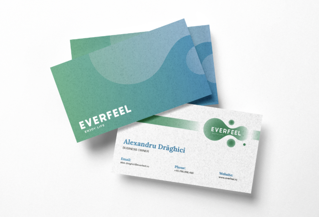
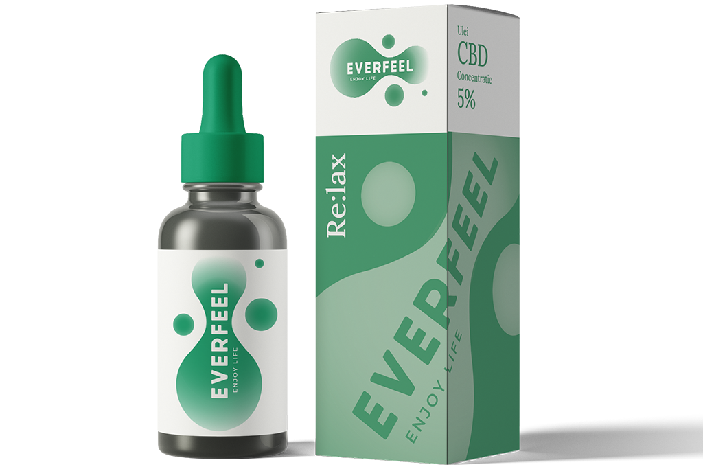
The color system and gradients were developed to reinforce softness and approachability while maintaining a modern, premium tone. We extended the identity into packaging design, brand guidelines and ecommerce UI, ensuring a cohesive experience from product shelf to digital checkout.
Beyond visuals, we supported platform development to align the user experience with the brand’s calm, minimal aesthetic.
Everfeel emerged as a coherent, modern wellness brand with a distinctive visual language and scalable identity system. The brand communicates trust and simplicity while maintaining strong shelf presence and a seamless ecommerce experience.
The result is a startup positioned for growth with a clear identity foundation and a consistent digital and physical brand presence.