Ergonexergo was delivering high-level industrial energy analysis services, but their market image did not reflect the technical depth and professionalism of their work. The brand lacked clarity, visual coherence and authority in communication.
The objective was to reposition the company as a structured, credible industrial partner capable of operating confidently in technical environments. The identity needed to communicate precision, performance and industrial relevance — not creativity for its own sake.
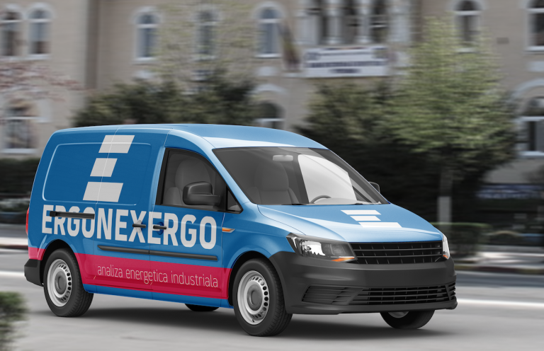
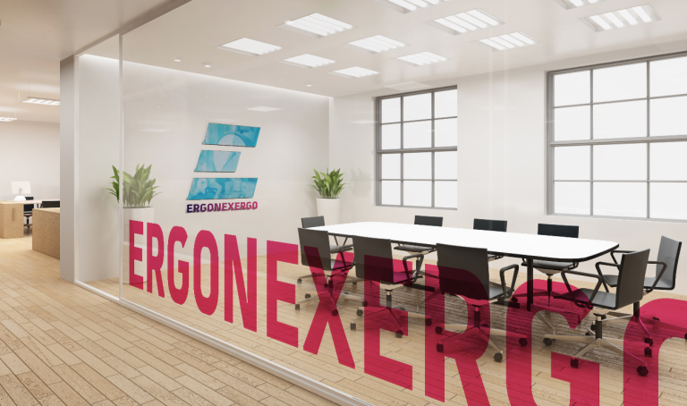
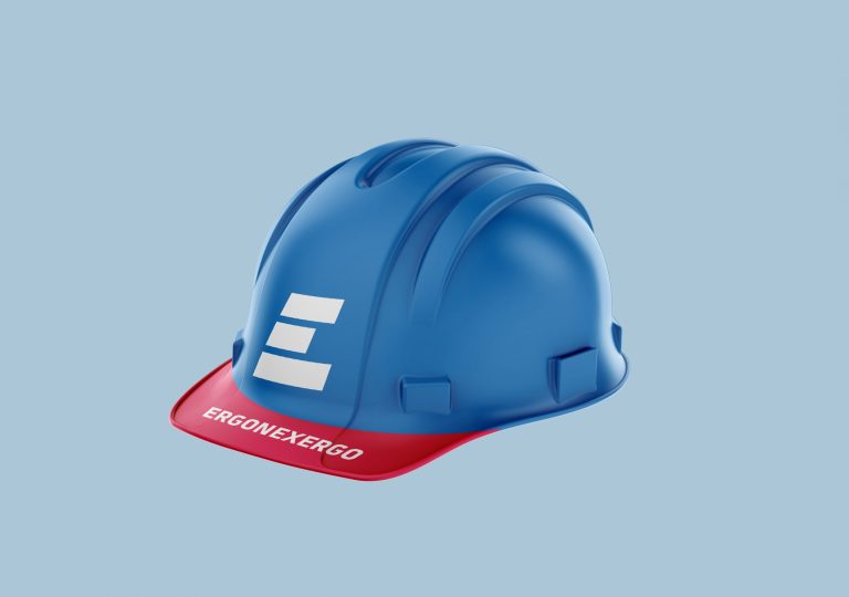
At the same time, the brand had to function consistently across physical applications: corporate materials, equipment, uniforms and vehicle branding.
We developed a structured brand identity built around strength, modularity and industrial clarity. The visual system combines technical blue tones with a strong accent color, reinforcing energy, movement and operational focus.
The logo and graphic language were designed to scale effectively across touchpoints — from business cards and print collateral to safety helmets and fleet vehicles — ensuring visibility and recognition in real-world industrial contexts.
Ergonexergo transitioned from a technically capable but visually underrepresented company to a confident, clearly positioned industrial brand. The new identity strengthened credibility, improved market perception and created a cohesive visual presence aligned with the quality of their services.
